3.23.2014

Horizontal versus Vertical


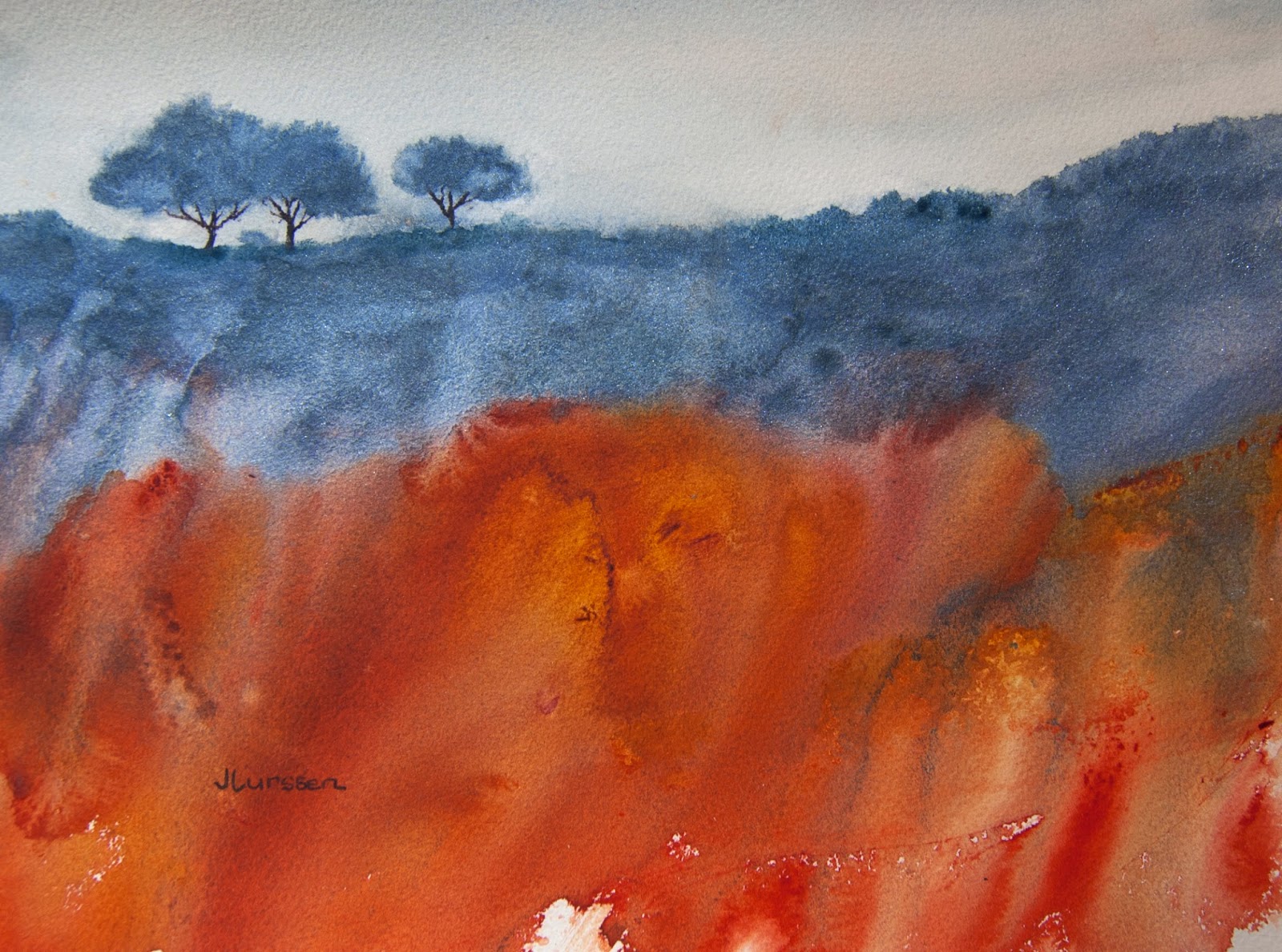
This painting of an abstract landscape is a classic example of a painting that should have been painted in a horizontal instead of vertical format. I realized this the minute I finished it and thought I would just crop it, but I wasn't that happy with the trees all bunched together - thought that was a bit boring - so I painted a second watercolors using the horizontal format. If I had only followed what I learned during my years with Jerry Stitt AWS, I would have first done a sketch in both formats to see which looked better. It would have been pretty obvious, I think. Below is my second attempt with one of the the trees a little separated, which I think makes for a more interesting composition. I used my new Daniel Smith kyanite genuine for the shrubs and trees and transparent pyrrol orange and quinacridone gold for the rest of the painting. I also used a blue for the sky instead of the warm colors in the first piece. I think this works better. Size is 11" x 14".


3.18.2014

Poppy Field


I wanted to paint a watercolor in a more abstract way than painting the detail of the buttercups - or what we call here in America the California poppy. I prefer a more abstract approach to this type of painting. I used Indian Yellow, Quinacridone gold, Aureolin and a little transparent pyrrol orange for the fields, and my new Daniel Smith kyanite genuine for the foreground rocks and Blue apatite genuine for the distant mountains. Size is 11" x 14".

3.14.2014

Experiments in Watercolor


I painted two small 5" x 7" watercolors like I sometimes do before attempting a larger piece to see which colors work best in the composition. The state flower of California is the poppy and they flower prolifically in spring in fields of deep yellow as far as the eye can see. I wanted to have a more abstract approach to representing them too. I also was trying out two new colors I bought from Daniel Smith - Blue Apatite Genuine in the piece above for the distant bushes, and Kyanite Genuine in the painting below. You can't see it in the painting below but the blue/gray has a metallic sparkle to it which is very appealing.


3.06.2014

Mt Tam Mist


I don't usually like doing commissions but when someone admires a painting you do that is no longer available, and they request something similar, it becomes a challenge to create a painting with the same mood but that is different from the one they admired. This week I received an email from someone who liked my painting Mist Over Mt Tam. They asked me if I would do a painting of the mountain with a similar "peaceful mood". They wanted it as a gift for a friend who loved to hike on Mt Tam but who was leaving California to live across country. Mt Tam is a very imposing mountain in Marin County and in winter the peak is often shrouded in mist. It makes for a great painting subject. I am pleased with the results of this piece. It's a little abstract while still being recognizable. It's essentially different shades of gray. I used various shades of liquid graphite (comes in a tube) for most of the painting - I was pleased with the subtle textures it created. The trees and sky were painted with Payne's Grey watercolor. Painted on Arches hot-pressed watercolor paper. I always tell people I won't be offended if they don't like a piece because I can always put it up for sale. I almost want to keep this one myself though. I like the soft visual effect.