12.22.2014

Marsh Evening


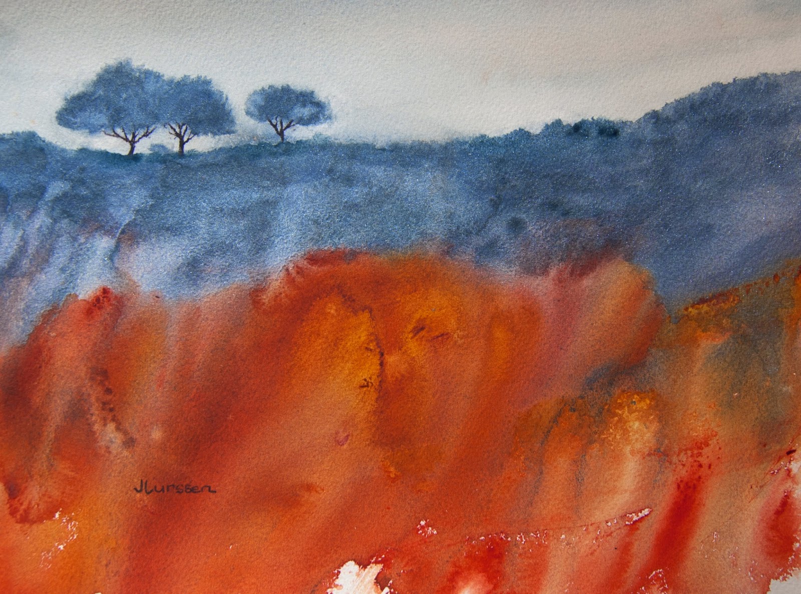
I haven't painted in a while. However, having sold nine paintings in the month of December, I figure I had better get busy again. For anyone wondering how to go about selling their art, I have had a lot of success with the online gallery zatista.com.  They sell my paintings regularly - this year I sold 19 through them. They also have a store on amazon.com and list all of the paintings in their gallery on their amazon store, where art seems to sell quite well. The downside is that zatista takes 45% commission on each sale. But then, if I didn't have my paintings on their site, I probably would still have them in my inventory, which is one way of looking at it.  I have sold all of my sunset and marsh paintings so wanted to paint another in the same series since the subject appeals to me. This is probably my last painting of the year so I wish all my fellow bloggers happy holidays and a fruitful painting new year.

10.03.2014

Mt Tam Mist


I painted this one of Mt Tam too late to enter the O'Hanlon Gallery exhibition but I quite like how it came out. Only used two colors, Payne's grey and French ultramarine.I managed to get Serpentine Mountain and the previous Mist Over Mt Tam accepted in the juried exhibition.

9.23.2014

Fall Colors


It's that time of year again. I love painting the fall colors - reminds me of our time living in Virginia. I donated this watercolor to my local Marin Society of Artists for their annual auction fundraiser. Each time I paint one of these scenes I try out different colors. For this piece I first thoroughly wet the paper and then painted a very diluted wash of oreolin. After it was dry I spattered different combinations of color with different size brushes and then spritzed the spatters with water just slightly to give the spatters uneven shapes. When that was dry I dabbed the piece with scrunched up saran wrap dipped in different colors. I used cad red mixed with new gamboge, raw sienna mixed with burnt sienna, lemon yellow with burnt sienna, oreolin with burnt sienna, and for the browns, burnt sienna mixed with french ultramarine.  I was particularly please with how the brown worked out, also supplying the needed darks to the watercolor.

8.22.2014

Mountain Dreamscape


For those who have not read my previous two blogs, I am doing a series on Mt Tam to enter in an upcoming local exhibition. I'm trying out different techniques and when I've exhausted ideas, I will pick three of the best to enter in the show. I wanted to try the gouache gold dust I bought as an experiment. It was hard to photograph and capture how it really looks. This is the closest I got. I did texturing on the mountain peak and dribbled string gel over the first wash of qunacridone gold, then painted Pyrrole Orange over that. The sky was a mix of about three blues plus a little quinacridone magenta and the gold dust - maybe a little too much of the gold. Still trying to decide

8.12.2014

Serpentine Mountain


Here is my abstract version of Mt Tam. I used one of the techniques mentioned in Ann Blockley's latest book by using cling film over the wet paint to create texture. The colors I used were quinacridone burnt orange, Prussian green and quinacridone gold - with some sepia ink squeezed under the cling film to add more texture. I thought the textures came out quite well and gave the mountain nice contours while remaining abstract. As it happens the stone on Mt Tam is called serpenting stone and is this very color green. This piece made it into the exhibition.

8.08.2014

Mist Over Mt Tam


I am currently working on a series of watercolors depicting Mt Tamalpais to enter in a local gallery exhibition where the theme is "Under The Spell of Mt. Tam." I can enter up to three paintings, so I thought I would try to approach the subject in three very different ways. Mt. Tam is a very imposing mountain that can be seen from most areas in Marin. At it's highest point it is 2,574 feet and is often shrouded in mist - making a great subject for painting. Above is my first attempt with the mist coming down over the mountain.  I want to also do an abstract version and a night scene incorporating the mountain. My next two posts will follow this one - if they are successful that is. Update: this piece made it into the exhibition along with Serpentine Mountain.

7.24.2014

Through The Woods


This watercolor was inspired by a black and white photograph - a good exercise in being creative with color. The photo was also a good guide for the lights and darks. I took a lot of artistic license changing shapes and leaving out a water scene in the background and replacing it with distant trees. I used quinacridone gold, cadmium yellow, cobalt blue and Prussian blue and sepia ink for the textures in the foreground.

6.24.2014

Last Glow Of Sunset


I was aiming for a tonalist look in this watercolor, using a number of glazes to achieve the result I wanted. It's easy to do too many glazes and ruin the painting by overworking it, or too few and not quite achieving one's goal. I'm a great admirer of the tonalist painters who mostly painted in oils. Tonalism was eventually eclipsed by impressionism and European modernism." I love trying to create atmosphere in my watercolors. The colors I used were quinacridone gold, brown madder, neutral tint, transparent pyrrol orange, Payne's grey and burnt umber. Also some sepia ink for the texture in the foreground.


6.09.2014

Golden Sunset


I'm really enjoying practicing my abstract landscapes inspired by my new Ann Blockley book. For this watercolor I did a number of glazes using brown madder, burnt sienna, Indian yellow and cobalt blue - just mixing them on the paper with no definite plan at first. While the paint was still wet I dropped in a sprinkling of Schmincke Tro-Col-Bronze in light gold - it's a powdered gouache. You can see the shimmer of the gold dust in the sky area. I then painted in the trees with sepia ink which mixed with the gold dust giving the trees quite a nice halo effect.

5.29.2014

Jean Haines Painting Challenge

 I was astounded on opening my email this morning to find that I was one of five winners of the Jean Haines Painting Challenge in the British magazine, Painters Online. The theme was the use of the color yellow. There were 203 entries altogether, which makes me feel even more honored to be one of the winners.

Special thanks to Laura who suggested I enter my painting in this event.

Here is the link to the other winners and all the entries in the challenge. 


5.02.2014

Tangled Woodland

autumn landscape

I do like the color combinations in this watercolor experiment. I used quinacridone burnt orange, Prussian green and quinacridone gold. For the sky I used the same colors very diluted and added plastic wrap to the wet paint for subtle texture. The branches on the left were done with sepia ink. For the textures in the lower half I used cheese cloth and a really nice netting that I found at a local fabric store that had more uneven spaces. I tore and pulled it out of shape a little to get a more natural design. See photo below of the netting pattern. You can see the texture from this pattern in the gold and green areas of the painting. In the upper green area I used cheese cloth. Inspired by reading Ann Blockley and attempting to make it my own.


4.28.2014

Windswept Hill


I have spent the last week or two reading my new Ann Blockley book, Experimental Landscapes in Watercolor. Ann is a master with innovative ways to create texture in watercolors. It's a wonderful book, full of creative ideas. I have also been practicing some of the techniques - which are more difficult than they seem. Hopefully I will be able to come up with a painting using some of these techniques soon. In the mean time, here is my latest atmospheric watercolor. I decided not to use too much texture since the focal point is the area of light where I used burnt sienna to draw the eye to this area of the painting.

3.23.2014

Horizontal versus Vertical


This painting of an abstract landscape is a classic example of a painting that should have been painted in a horizontal instead of vertical format. I realized this the minute I finished it and thought I would just crop it, but I wasn't that happy with the trees all bunched together - thought that was a bit boring - so I painted a second watercolors using the horizontal format. If I had only followed what I learned during my years with Jerry Stitt AWS, I would have first done a sketch in both formats to see which looked better. It would have been pretty obvious, I think. Below is my second attempt with one of the the trees a little separated, which I think makes for a more interesting composition. I used my new Daniel Smith kyanite genuine for the shrubs and trees and transparent pyrrol orange and quinacridone gold for the rest of the painting. I also used a blue for the sky instead of the warm colors in the first piece. I think this works better. Size is 11" x 14".


3.18.2014

Poppy Field


I wanted to paint a watercolor in a more abstract way than painting the detail of the buttercups - or what we call here in America the California poppy. I prefer a more abstract approach to this type of painting. I used Indian Yellow, Quinacridone gold, Aureolin and a little transparent pyrrol orange for the fields, and my new Daniel Smith kyanite genuine for the foreground rocks and Blue apatite genuine for the distant mountains. Size is 11" x 14".

3.14.2014

Experiments in Watercolor


I painted two small 5" x 7" watercolors like I sometimes do before attempting a larger piece to see which colors work best in the composition. The state flower of California is the poppy and they flower prolifically in spring in fields of deep yellow as far as the eye can see. I wanted to have a more abstract approach to representing them too. I also was trying out two new colors I bought from Daniel Smith - Blue Apatite Genuine in the piece above for the distant bushes, and Kyanite Genuine in the painting below. You can't see it in the painting below but the blue/gray has a metallic sparkle to it which is very appealing.


3.06.2014

Mt Tam Mist


I don't usually like doing commissions but when someone admires a painting you do that is no longer available, and they request something similar, it becomes a challenge to create a painting with the same mood but that is different from the one they admired. This week I received an email from someone who liked my painting Mist Over Mt Tam. They asked me if I would do a painting of the mountain with a similar "peaceful mood". They wanted it as a gift for a friend who loved to hike on Mt Tam but who was leaving California to live across country. Mt Tam is a very imposing mountain in Marin County and in winter the peak is often shrouded in mist. It makes for a great painting subject. I am pleased with the results of this piece. It's a little abstract while still being recognizable. It's essentially different shades of gray. I used various shades of liquid graphite (comes in a tube) for most of the painting - I was pleased with the subtle textures it created. The trees and sky were painted with Payne's Grey watercolor. Painted on Arches hot-pressed watercolor paper. I always tell people I won't be offended if they don't like a piece because I can always put it up for sale. I almost want to keep this one myself though. I like the soft visual effect.

1.16.2014

Winter Glow


More experimenting with acrylic inks. I feel I need a lot of improvement still and need to branch out a bit. I do like the colors in this experiment though. For any of you who have never seen Ann Blockley's acrylic ink paintings, they are definitely worth a visit, as is all of her work.  Click on her name to go to her blog post. There is a lovely acrylic ink painting just below the post for her latest book - which I will definitely order. She is a great inspiration for the kind of watercolors I like painting.

1.09.2014

Mystic Glade


I was lucky enough to get two nice gift certificates for Christmas to my favorite local art store. It is fun to browse around and buy materials for experimenting without having to be conscious of the cost. In 2013 I started to experiment with acrylic inks and had some successes which I have posted previously on my blog. I bought a few more colors this year and was excited to do more experimenting. The first two attempts were not that successful, but I was pleased with this third try. I found that it worked better if I applied a layer of gesso to the watercolor paper and let it dry before applying the inks.  Playing around like this really helps one loosen up.