Showing posts with label california watercolors. Show all posts

2.17.2017

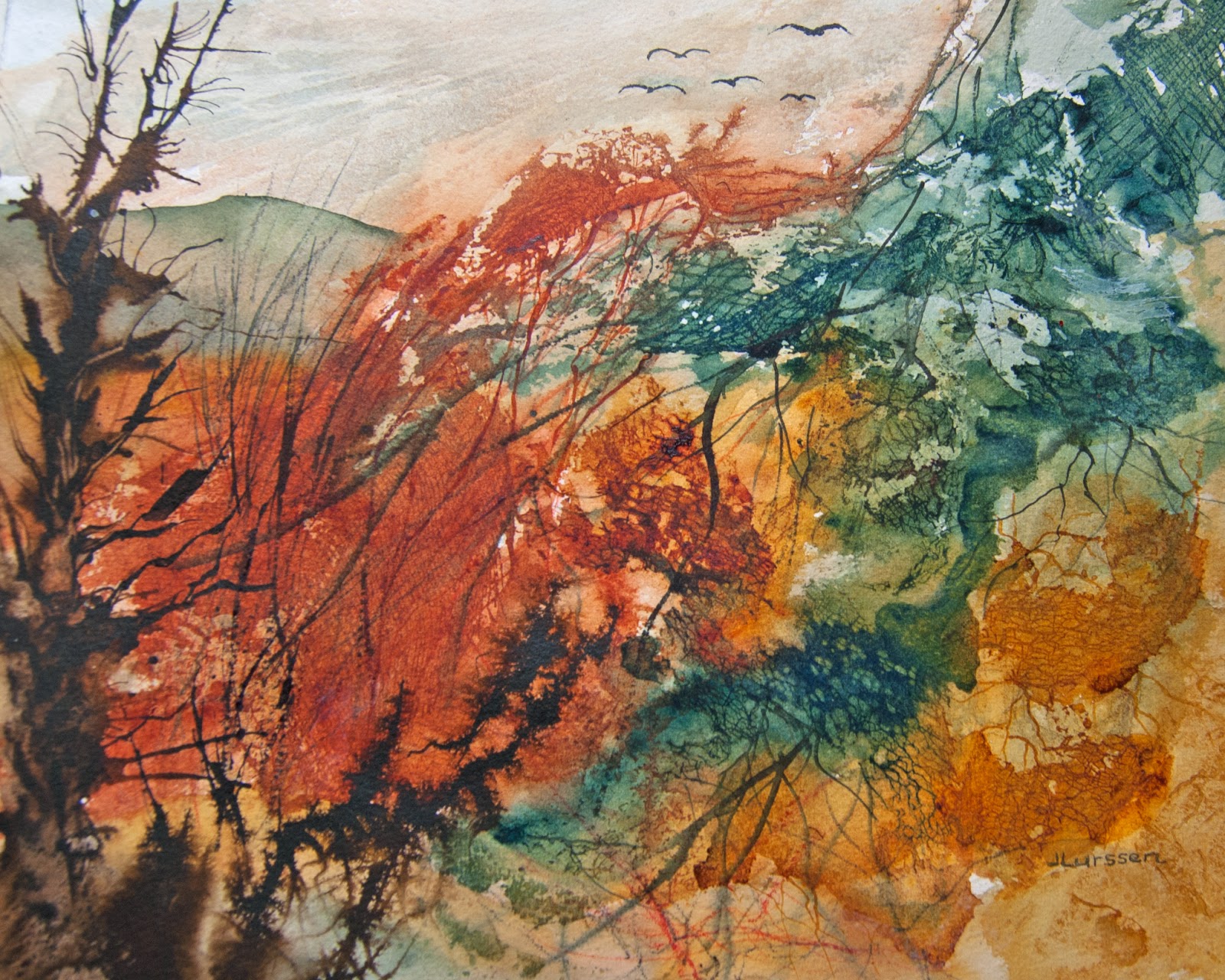
Abstract Landscape Patterns


I love experimenting with textures. Have some old netting that I bought for this purpose. It worked out quite well in this piece. Also added a few scrapes with a sharp knife to create more texture.

9.04.2016

Blue Vision


I like to simplify my paintings and nearly always work wet-in-wet. I like the soft look it creates. I live in the seaside town of Sausalito CA, and the surrounding landscapes are an endless inspiration for my watercolors. We have the bay on one side and the mountains on the other - not to mention the redwood forests and nearby marshes. I am inspired by all of this, but at the same time like to put my own interpretation on what I see, sometimes changing the colors and other times using materials to stretch the boundaries of my watercolors.

7.18.2016

Storm Over The Marsh


Another wet-in-wet watercolor inspired by World Watercolor Month. I love to paint the marshes in different lights. I used only three colors for this watercolor, raw sienna, burnt sienna and neutral tint. I find the neutral tint mixed with burnt sienna makes a lovely rich dark.

5.27.2016

Stormy Sky


I am in the process of creating a new video course on how to paint dramatic skies. This is the painting that I am demonstrating. I am quite pleased with how it came out. I was going to add some distant trees on the right but decided against it at the last minute. Still not sure if that was the right decision. Would love some opinions on this.

3.11.2016

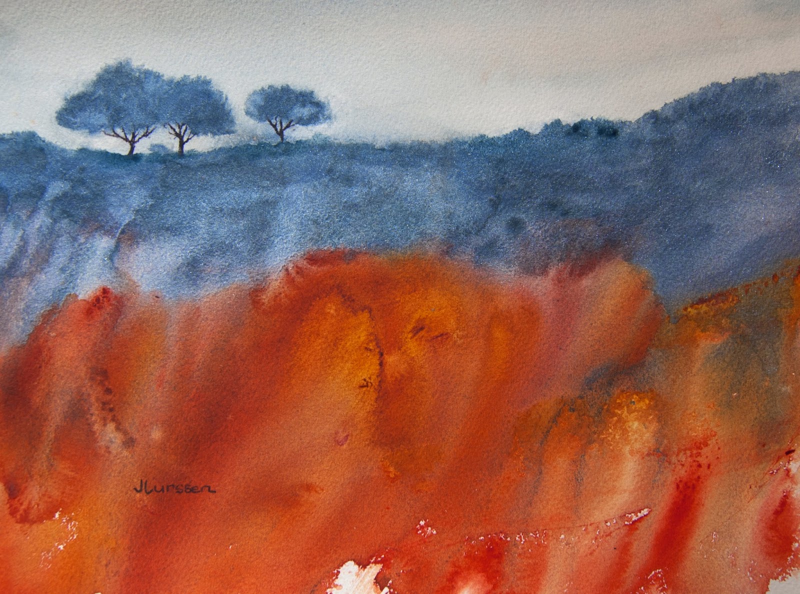
Landscape Patterns


More experimenting with color and textures. I am pleased with this one. The colors worked out well together. I used Daniel Smith's perrylene violet, quinacridone gold and permanent brown (which is actually a very nice reddish color). For the trees I used burnt umber acrylic ink. When you experiment sometimes the colors don't quite work well together, or are too bright or dull or end up being muddy. I threw three in the trash before coming up with this one.

1.05.2016

Dreamscape II


First painting of the new year. Feeling inspired. Trying out new colors and textures - having fun. Painting is great therapy. It's my way to relax.  Just wish I was better at coming up with good titles for my paintings. Something I need to work on this year. For the trees in this watercolor I used transparent red oxide and for the grays in the foreground I used cobalt blue + aureolin yellow + rose madder genuine. I am pleased with the results. Trying to keep my watercolors loose.

12.20.2015

Dreamscape


After spending the last few months creating my how-to painting videos I finally got down to painting again. I decided to try using colors I had never used before and see if I could incorporate them into a landscape. I think it worked for this imaginary landscape and I am pleased with the results. I used phthalo turquoise, transparent red Iron oxide and quinacridone burnt scarlet. Then while still wet, used some cling film to create the textures in the foreground. For sale on my web site at http://thewatercolorist.net/dreamscape/

7.11.2015

Fall Scene Video Course


I'm very excited that my video course on how to paint this fall scene now has more than 700 students enrolled on the learning site Udemy.com. Now I have to get down to painting again since I am running out of inventory, having spent the last six weeks doing this video.
https://www.udemy.com/paint-a-stunning-fall-watercolor-in-seven-easy-steps/

5.15.2015

Blood Moon


Having fun with Schmincke's tro-col bronze dry gouache powder. We had an eclipse recently and I was inspired to come up with a dramatic piece involving the moon. I remember my old art teacher, Jerry Stitt, telling us it's never a good idea to have a large orb in your painting which the eye then gravitates towards. So the way around it is to create a cloud or two across the  circle which breaks it up and lets the eye circulate around the painting. I used indanthrone blue, new gamboge and perrylene maroon watercolors and sprinkled the Schmincke's dry gouache in pale gold over the wet watercolor and rocked it back and forth until I was satisfied with the pattern. I love experimenting with interesting materials to stretch the boundaries of watercolor. Schmincke has a few different colors in their tro-col-bronze dry gouaches. You can get some interesting results mixing them in with your watercolors.

5.10.2015

Fall Glory


I know it's not yet that time of year, but I wanted to experiment with a combination of yellows and oranges for a course I am creating on the site udemy.com on how to paint a fall landscape. I am pleased with these particular color combinations and think I will go with them. It's paradoxical that fall leaves create such a beautiful site in their dying throes. I used Daniel Smith's new gamboge,  golden ochre, cadmium red mixed with new gamboge and French ultramarine mixed with burnt umber for the few darks in the leaves. For the ground area I dribbled sepia ink over the watercolors for texture.

4.16.2015

Patterns In The Landscape


This is a small 5"x7" test piece I did to see if the colors would work together for a larger piece. Sometimes I end up liking the test piece better than the larger watercolor. Have not attempted the larger piece yet but will soon. I used Indigo, yellow ochre and burnt umber on Fabriano cold pressed watercolor paper.  The textures in the landscape were achieved using cling film. I like to create a semi-abstract section in each of my watercolors.

3.12.2015

Thistles


I'm back in the painting groove again. I was going through a bit of painting block so I decided to change tack and paint some flowers instead of the usual landscapes and seascapes. These thistles grow prolifically on the trail we use to exercise our dogs. I have taken a number of photos of them but until now have not attempted to paint them. I like to keep my flower paintings loose, leaving something to the imagination for the viewer. I did two paintings because I wasn't quite happy with the first one, and I am still not that happy with the second one. I may have a third go and if it is better will post it.


2.20.2015

Low Tide


My first painting of 2015. Our house overlooks Richardson Bay and a spit of land called the Strawberry Peninsula.  I've wanted to paint an atmospheric watercolor of this scene for some time. I watch the tides come in and go out daily and it makes for an interesting subject. I was trying out some new Daniel Smith colors, particularly perrylene violet ,which dominates this painting. I  could have included some yachts but wanted to keep it a more quiet peaceful scene. I'm still thinking of maybe adding a few yachts though.

12.22.2014

Marsh Evening


I haven't painted in a while. However, having sold nine paintings in the month of December, I figure I had better get busy again. For anyone wondering how to go about selling their art, I have had a lot of success with the online gallery zatista.com.  They sell my paintings regularly - this year I sold 19 through them. They also have a store on amazon.com and list all of the paintings in their gallery on their amazon store, where art seems to sell quite well. The downside is that zatista takes 45% commission on each sale. But then, if I didn't have my paintings on their site, I probably would still have them in my inventory, which is one way of looking at it.  I have sold all of my sunset and marsh paintings so wanted to paint another in the same series since the subject appeals to me. This is probably my last painting of the year so I wish all my fellow bloggers happy holidays and a fruitful painting new year.

10.03.2014

Mt Tam Mist


I painted this one of Mt Tam too late to enter the O'Hanlon Gallery exhibition but I quite like how it came out. Only used two colors, Payne's grey and French ultramarine.I managed to get Serpentine Mountain and the previous Mist Over Mt Tam accepted in the juried exhibition.

8.12.2014

Serpentine Mountain


Here is my abstract version of Mt Tam. I used one of the techniques mentioned in Ann Blockley's latest book by using cling film over the wet paint to create texture. The colors I used were quinacridone burnt orange, Prussian green and quinacridone gold - with some sepia ink squeezed under the cling film to add more texture. I thought the textures came out quite well and gave the mountain nice contours while remaining abstract. As it happens the stone on Mt Tam is called serpenting stone and is this very color green. This piece made it into the exhibition.

6.09.2014

Golden Sunset


I'm really enjoying practicing my abstract landscapes inspired by my new Ann Blockley book. For this watercolor I did a number of glazes using brown madder, burnt sienna, Indian yellow and cobalt blue - just mixing them on the paper with no definite plan at first. While the paint was still wet I dropped in a sprinkling of Schmincke Tro-Col-Bronze in light gold - it's a powdered gouache. You can see the shimmer of the gold dust in the sky area. I then painted in the trees with sepia ink which mixed with the gold dust giving the trees quite a nice halo effect.

5.02.2014

Tangled Woodland

autumn landscape

I do like the color combinations in this watercolor experiment. I used quinacridone burnt orange, Prussian green and quinacridone gold. For the sky I used the same colors very diluted and added plastic wrap to the wet paint for subtle texture. The branches on the left were done with sepia ink. For the textures in the lower half I used cheese cloth and a really nice netting that I found at a local fabric store that had more uneven spaces. I tore and pulled it out of shape a little to get a more natural design. See photo below of the netting pattern. You can see the texture from this pattern in the gold and green areas of the painting. In the upper green area I used cheese cloth. Inspired by reading Ann Blockley and attempting to make it my own.


4.28.2014

Windswept Hill


I have spent the last week or two reading my new Ann Blockley book, Experimental Landscapes in Watercolor. Ann is a master with innovative ways to create texture in watercolors. It's a wonderful book, full of creative ideas. I have also been practicing some of the techniques - which are more difficult than they seem. Hopefully I will be able to come up with a painting using some of these techniques soon. In the mean time, here is my latest atmospheric watercolor. I decided not to use too much texture since the focal point is the area of light where I used burnt sienna to draw the eye to this area of the painting.

3.23.2014

Horizontal versus Vertical


This painting of an abstract landscape is a classic example of a painting that should have been painted in a horizontal instead of vertical format. I realized this the minute I finished it and thought I would just crop it, but I wasn't that happy with the trees all bunched together - thought that was a bit boring - so I painted a second watercolors using the horizontal format. If I had only followed what I learned during my years with Jerry Stitt AWS, I would have first done a sketch in both formats to see which looked better. It would have been pretty obvious, I think. Below is my second attempt with one of the the trees a little separated, which I think makes for a more interesting composition. I used my new Daniel Smith kyanite genuine for the shrubs and trees and transparent pyrrol orange and quinacridone gold for the rest of the painting. I also used a blue for the sky instead of the warm colors in the first piece. I think this works better. Size is 11" x 14".