This painting of an abstract landscape is a classic example of a painting that should have been painted in a horizontal instead of vertical format. I realized this the minute I finished it and thought I would just crop it, but I wasn't that happy with the trees all bunched together - thought that was a bit boring - so I painted a second watercolors using the horizontal format. If I had only followed what I learned during my years with
Jerry Stitt AWS, I would have first done a sketch in both formats to see which looked better. It would have been pretty obvious, I think. Below is my second attempt with one of the the trees a little separated, which I think makes for a more interesting composition. I used my new Daniel Smith kyanite genuine for the shrubs and trees and transparent pyrrol orange and quinacridone gold for the rest of the painting. I also used a blue for the sky instead of the warm colors in the first piece. I think this works better. Size is 11" x 14".

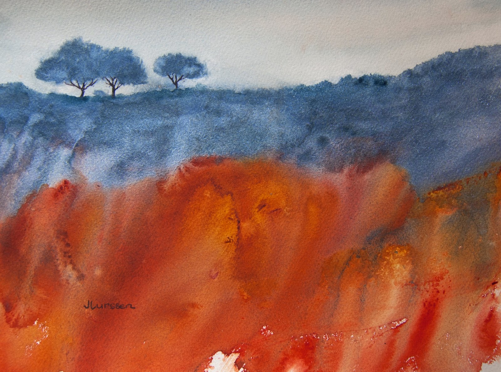
Jean...I think I like that top one (vertical) the most...In that top one, there's this big mass of red grasses in the foreground and then my eye is drawn up to the grouping of trees on the hill.
ReplyDeleteThanks Ernie. It's interesting that all of the comments here prefer the vertical. Just goes to show how subjective art is.
DeleteCall me Miss Contrary, Jean, but I think your vertical painting is do dramatic and interesting even if the trees are bunched together. I like it a lot.
ReplyDeleteThank you Joyfulartist.
DeleteI also like the vertical Jean... it somehow seems more unexpected, and the red in the foreground works better for me!!
ReplyDeleteMaybe it is because the red is brighter in this version.
DeleteYou know Jean, everyone has a different idea about the beauty.....and my feeling, looking these two versions is that the first one is more interesting and attractive than the horizontal one. I really like the strong and big mass of red (a fire, I think) and also the three lonely trees. Anyway both are really beautiful. Have a good week! Ciao.
ReplyDeleteSo BOLD and Interesting!
ReplyDeleteThank you Sue for visiting my blog and commenting.
DeleteI too like the portrait version Jean, an excitement of colours and an interesting composition
ReplyDeleteThanks Lorraine. As I said to Judith, maybe it is because in this version the red is brighter. All of the comments in favor of the first version made this very interesting for me.
Deletereally lovely work Jean each one presents a different view and each one is very nice in it's own way.
ReplyDeleteJean I,m drawn to the horizontal format .
ReplyDeleteJean you could paint another vertical panel to make an enlargement of your horizontal composition
ReplyDelete