Showing posts with label abstract. Show all posts
12.04.2018
Shades Of Winter
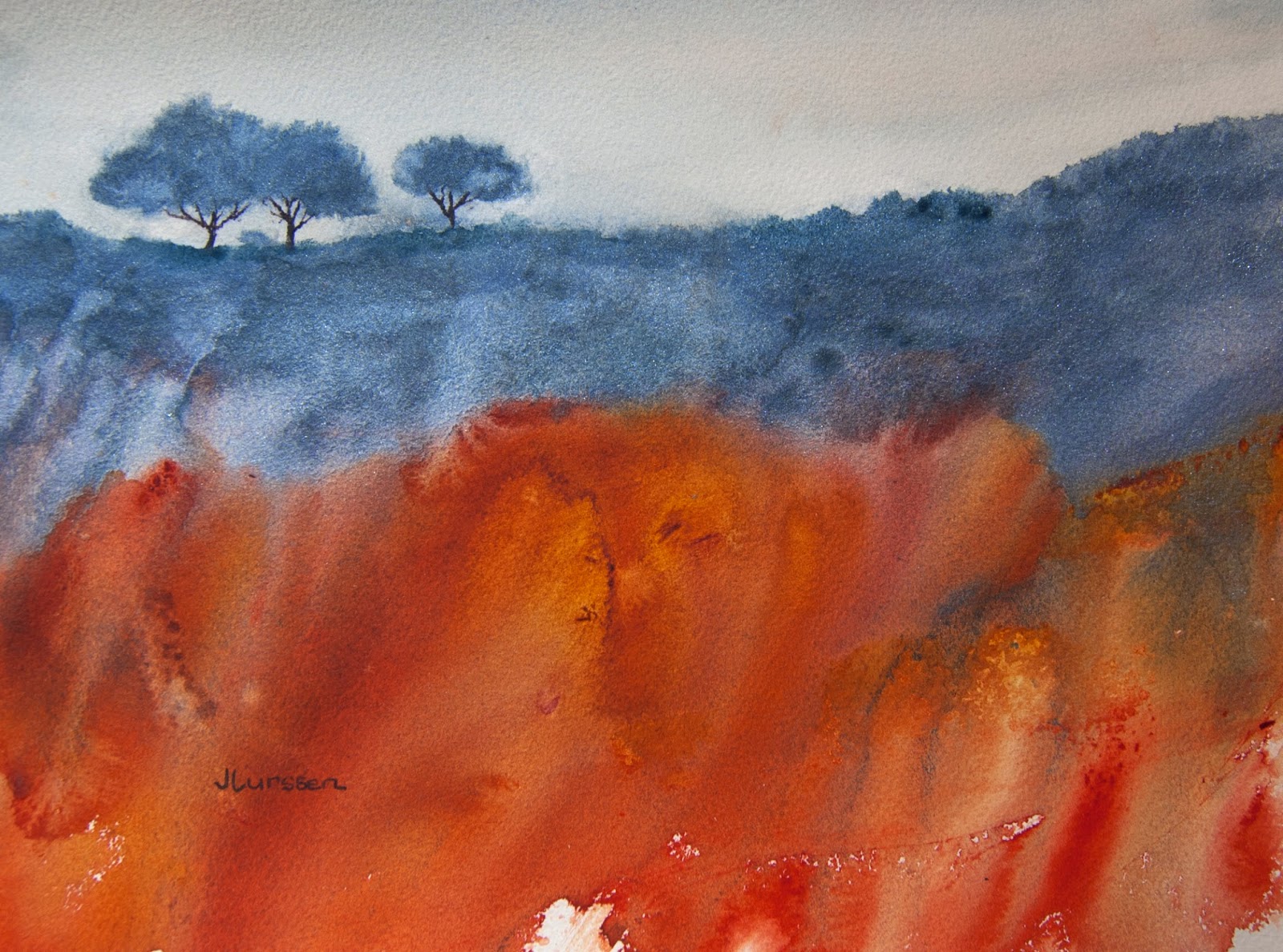
I painted this watercolor on a gray day in Sausalito, California. We look out over Richardson bay, which leads into San Fracisco bay. I love the neutral tones of the sky and land on days like this. As you can see, I took a lot of artistic license to make the watercolor more appealing. I wanted to show what one can do with a little imagination. I used only two colors, French ultramarine and quanacridone burnt orange. I did add a little white gouache for texture in the dark landscape area. The inspiration was from this photo below taken from my deck.
8.22.2014
Mountain Dreamscape
3.23.2014
Horizontal versus Vertical
3.06.2014
Mt Tam Mist
8.11.2013
Golden Dreamscape
For this watercolor I wanted to achieve a tonalist look. I did a light pencil sketch then sprayed my hot-pressed paper all over with a squirt bottle. For the sky I did a Quinacridone Gold wash and then glazed over it while still wet with Daler Rowney's sepia ink watered down so that all it did was tone down the gold color. I added the same gold color to the bottom area, then painted over that with watered down acrylic green gold. I added the trees with sepia ink, which tends to run on a wet surface, making some nice soft edges. I carried down the sepia to suggest tree roots and added granulation medium for texture. Size: 11.5" x 7.5"
8.01.2013
Tangled Undergrowth
I'm still on a roll with watercolor texturing. I think I even prefer this one to the previous post, because the colors are more muted. I used Daniel Smith's perrylene green, transparent red iron oxide and Dailer Rowney's sepia acrylic ink. I used granulation medium on the sepia ink in the foreground which breaks up the ink and creates these wonderful textures.
7.22.2013
Aftermath
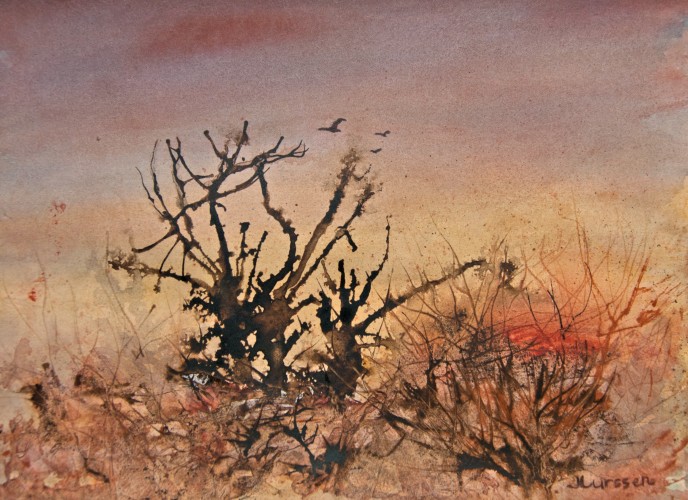
I love experimenting with textures. A few of my favorite artists who use lots of texture are Ann Blockley, Jean Haines, and Australian watercolorist John Lovett. It's not as easy as it looks from their paintings. Ann Blockley creates such interesting paintings using lines and squiggles and watercolor mixed in with acrylic inks, gouache, granulation medium and plastic wrap. After much practice, I was quite pleased with this one. However, I made the mistake of using all warm colors and not having a contrast of warm against cool, so I glazed over the sky area with indanthrone blue mixed with alizarin, hoping it wouldn't ruin the piece. I think it worked. A good friend came up with the title for me. It does look like the aftermath of a big storm. I used acrylic inks and watercolors for this one. I'm enjoying exploring with mixed media for special effects.
Subscribe to:
Posts (Atom)