This is a place in Cumbria, England called Grange Over Sands. The photo below is courtesy of a cousin. I liked the peaceful scene but wanted to change the colors to create a more atmospheric feeling to the place. Hope I achieved this. Artistic license is a liberating feeling.
Showing posts with label watercolor landscape. Show all posts
1.14.2016
6.24.2014
Last Glow Of Sunset
I was aiming for a tonalist look in this watercolor, using a number of glazes to achieve the result I wanted. It's easy to do too many glazes and ruin the painting by overworking it, or too few and not quite achieving one's goal. I'm a great admirer of the tonalist painters who mostly painted in oils. Tonalism was eventually eclipsed by impressionism and European modernism." I love trying to create atmosphere in my watercolors. The colors I used were quinacridone gold, brown madder, neutral tint, transparent pyrrol orange, Payne's grey and burnt umber. Also some sepia ink for the texture in the foreground.
6.09.2014
Golden Sunset
1.09.2014
Mystic Glade
I was lucky enough to get two nice gift certificates for Christmas to my favorite local art store. It is fun to browse around and buy materials for experimenting without having to be conscious of the cost. In 2013 I started to experiment with acrylic inks and had some successes which I have posted previously on my blog. I bought a few more colors this year and was excited to do more experimenting. The first two attempts were not that successful, but I was pleased with this third try. I found that it worked better if I applied a layer of gesso to the watercolor paper and let it dry before applying the inks. Playing around like this really helps one loosen up.
7.22.2013
Aftermath
I love experimenting with textures. A few of my favorite artists who use lots of texture are Ann Blockley, Jean Haines, and Australian watercolorist John Lovett. It's not as easy as it looks from their paintings. Ann Blockley creates such interesting paintings using lines and squiggles and watercolor mixed in with acrylic inks, gouache, granulation medium and plastic wrap. After much practice, I was quite pleased with this one. However, I made the mistake of using all warm colors and not having a contrast of warm against cool, so I glazed over the sky area with indanthrone blue mixed with alizarin, hoping it wouldn't ruin the piece. I think it worked. A good friend came up with the title for me. It does look like the aftermath of a big storm. I used acrylic inks and watercolors for this one. I'm enjoying exploring with mixed media for special effects.
12.23.2010
First Snow - Holiday Greetings
Thought this would be an appropriate subject for the holiday season. I was practicing painting winter landscapes and tried a technique I found in one of my watercolor books "Watercolor Painting Techniques". A watercolor by Zoltan Szabo shows a technique to depict this snow scene. I was pleased with the result so decided to post it. I changed my piece around a bit and added foreground scrub and a darker effect with the trees and background. Watercolors used were burnt sienna mixed with French ultramarine for the sky and distant trees and Antwerp blue mixed with burnt sienna for the foreground trees, then sprinkled with salt for the snow effect. Size: 10" x 6.5".
I wish all my fellow bloggers a very happy holiday weekend and much joy and prosperity for 2011.
12.13.2010
First Light
We have been experiencing the most incredible skies early in the morning lately. Fortunately I get up early enough to see them. For this watercolor I did an underpainting with raw sienna and then used brown madder and French ultramarine mixed with a little payne's grey. I really like the effect the limited palette provides. Size: 12" x 8".
12.04.2010
Dusk In The Headlands
Back to my atmospheric watercolors. I like trying out different color combinations to create the atmospheric feel in my watercolors. I love the work of Caroline Simmill and the colors she used in wash #4 for the One Hundred Washes blog challenge. When I tried painting with these colors I could not get them dark enough, even though I used ivory black. For this watercolor I used raw sienna and indigo (which when combined with other colors makes nice darks) and a little burnt sienna on the foreground hill.
Size: 10.5"x9".
11.23.2010
Winter's Day
We have had a few storms and some really cold days in Northern California this past week. Thought I would try to capture this in another atmospheric watercolor. I used an underpainting of lemon yellow and when it was dry I painted the clouds with indigo mixed with burnt sienna and a little raw sienna in the foreground. Size is 13.5" x 10".
10.29.2010
Evening Glow
Another atmospheric watercolor inspired by red skies. I've discovered this effect can only be achieved on hot pressed paper. I first tried it on cold pressed and the colors just soaked in and looked washed out. I'm doing more and more work on hot pressed paper. I like the way it keeps the colors vivid. I used aureolin yellow, brown madder, burnt sienna for the sky and french ultramarine with burnt sienna with a little sepia for the trees.
10.15.2010
At The Cliff's Edge
I have not posted anything in a while. Had a dry period which seems to happen around this time of year. I am drawn to dramatic landscapes and this scene of a lone tree at the top of a cliff appealed to me. As I described in my previous blog, there are these really tall cliffs as one walks along beautiful Kehoe Beach in west Marin, CA. A number of trees have fallen down the cliff and lay at the bottom, along the beach. This watercolor was also an exercise in creating texture and I was rather pleased with the result. The underpainting was raw sienna over which I used a pale Indigo for the sky. For the cliff I used burnt sienna, burnt umber, french ultramarine and sap green. The distant hills are cobalt blue.
8.28.2010
Kehoe Beach
West Marin County, California has some of the most beautiful unspoiled beaches. Kehoe Beach is one of them. We took a walk with the family and our two dogs on this pristine stretch of beach. There was a slight mist over the beach that added to the peacefulness. High cliffs were to our right and the sea to the left. We could see cows high up on the edge of the cliff - no fence. I used artistic license with regards to the colors. I used indigo mixed with raw sienna, brown madder and some burnt sienna with French ultramarine.
8.05.2010
African Bushveld
Since my profile mentions the fact that I am influenced by my time living in Africa as well as other areas of the world, I thought it time to depict an African scene. This watercolor is reminiscent of an area known as the Karoo in South Africa. It is very dry, hot scrubland that hardly ever gets any rainfall. The size is 13.5" X 10". I used raw sienna, aureolin yellow and burnt sienna for the glazed unperpainting and raw umber, french ultramarine, burnt sienna and some alizarin crimson for the details.
6.18.2010
Storm Clouds
Last week in class Jerry's demonstration painting was of large clouds over water. I liked the subject matter and wanted to give it a try but decided to paint the clouds with a landscape backdrop. I am working on another watercolor with storm clouds over an estuary, and will post that next. I wanted to use neutral colors to create the storm clouds, which I find interesting. I used indigo and burnt sienna with a touch of raw sienna in places - so it was a very limited palette. Size is 12" X 8".
6.09.2010
Desert Twilight
Trying out different color combinations in glazing. It's difficult to decide in advance what colors will work well together to give the end result one is trying to achieve. I think this one worked quite well. Laura's comment got me thinking that I must remember to list the colors I use. For this one I used a light glaze of Raw Sienna and several glazes of brown madder and ultramarine blue. After glazing I painted in the landscape with brown madder mixed with paynes grey and used paynes grey neat for the dark bushes and splatters in the foreground.
5.27.2010
Early Dawn
Still more glazing. I think I've found what I want to do with watercolors - for now anyway. I really like the luminous effect of glazing. I think it helps create more depth to even a simple subject. I took a few shortcuts with this one to see if fewer glazes would work as well. I was pleased with the outcome. Even though I used only two colors, indigo and Windsor red, I did at least five glazes with each color to give transparency to the piece.
3.09.2010
Morning Light
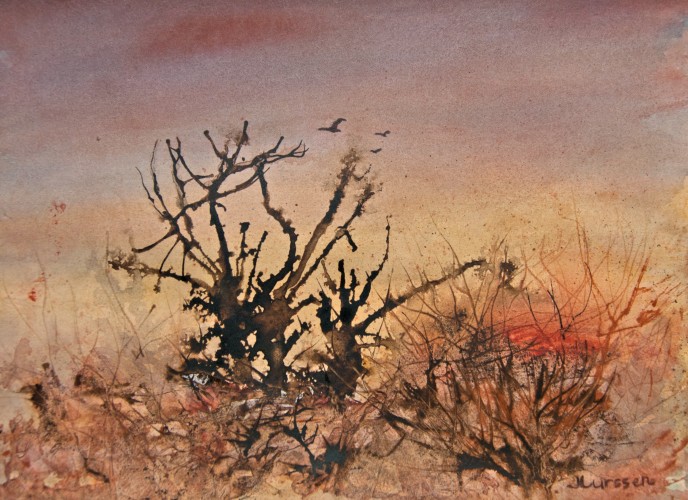
I wanted to try a very limited palette to create a mood painting. I used mostly raw sienna and paynes grey with a little burnt umber in the foreground. I got the idea for this color scheme from one of my John Blockley books. He does lovely mood landscapes, especially when painting English country cottages. He is a master at creating mood in his paintings.
Thank you Saundra for the sunshine blog award. I found it really difficult to choose who to pass this award to. That got me thinking and I would like to award it to all of the artists that follow my blog. They are all unique and deserving of this award. Thank you all for following my blog.
UPDATE: I took this watercolor to class today and Jerry's only comment (and I knew he was going to say this) was that with all the horizontal planes it needed a vertical plane to create tension and interest. While I get the point of this, I was aiming more at atmosphere and felt a large vertical would detract from the serenity of the watercolor. He covered my painting with a piece of perspex and drew in a near tree, which confirmed my feelings. I don't think I will take the advice this time.
1.31.2010
Mist Over Mt. Tam
I just realized that the last three watercolors I have posted are all in shades of blue. I guess I'm exploring painting winter weather in all its forms. Mt. Tam is a very imposing mountain and one can see it from just about everywhere in southern Marin County. It dominates the landscape. The mountain is often shrouded in mist this time of year and has these lovely blue hues. This is a mix of ultramarine grayed down with Paynes Grey. I really like the various blues one can achieve with this mix. The sky has a hint of pale raw sienna and rose madder under the blue. I will take this watercolor to class this week and see what the critique will be.
Critique: I'm pleased to say that Jerry Stitt really liked this watercolor. He made particular mention of the dark, medium and light values, and the lost and found edges which he felt made the painting work well. For the first time since I have been attending his class, there were no suggestions as to "what would make this a better painting". Hope I can keep this up.
Subscribe to:
Posts (Atom)