We've had some pretty stormy weather recently. Thought I would try to catch the mood over San Francisco bay during this period. I used hookers green mixed with Payne's grey for the sky and sea, and Raw Sienna for the beach. Size: 14" x 11".
Trees and sunsets - my favorite things to paint. I love atmospheric skies and what better setting to complete the picture than some dramatic trees. I used granulation medium in the foreground for the texture. For the sky I used a course painters brush to create the striations. Just four colors - transparent red iron oxide, cadmium red, Payne's grey and burnt umber.
This was an experiment with textures. I wanted to paint a subject where I could practice using different textures - hence the cliff. I used burnt sienna, burnt umber and sepia ink for the cliff and dribbled granulation medium in different areas to get texture. I also did some spattering. For the sky and distant trees I used indigo and indian yellow.I was quite satisfied with the cliff but feel the sky could have been a little more muted.
An attempt to capture the rain clouds I observed a few days ago. I worked wet-in-wet for the soft effect of the clouds and when that was dry, I painted in the mountains with hard edges as a contrast to the sky. I used just three colors - Payne's grey, burnt umber and yellow ochre. Size: 11.5x 7.5".
I have done a number of watercolors of the local marshes. They really appeal to me - not sure why. I used a dropper filled with watercolor to draw the reeds. I find it easier to be more loose with this method. The sky is done in layers with raw sienna for the under painting then red iron oxide with some neutral tint added. The hills in the background were a mixture of cobalt blue mixed with some Payne's grey. Size is 10.5"X13.5".
I like painting Mt. Tamalpais - or Mt Tam as we call it - in the different seasons. It looks so different in each season. It is often shrouded in mist which gives it a mysterious quality. In summer the scrub dries out and becomes a golden wheat color - as can be seen in my Mt. Tam Peak watercolor.
I had a few weeks of not liking anything that I painted - painter's block I guess. So I was thinking how to change course and come up with something totally different. I was thinking of the time I lived on the east coast and how lovely the fall colors were. I still wanted my watercolor to be more representational than realistic though. I started out by masking the tree trunks and glazing the paper with a pale yellow, followed by lots of splattering with different shades of yellow. When that was dry I removed the masking fluid and scrunched up some saran wrap, dipped it into various shades and dabbed them onto the page. I'm pleased with the result and think it worked out well.
I was thinking about adding a tree - for a vertical thrust - on the left of this watercolor but when I tried it on a print I had made for the purpose, I changed my mind. I felt it detracted from the sky which is the main focus of the watercolor. A friend suggested to me that this would look really good as a very large painting and I think it might. The size of this watercolor is 12" x10". I think I need to retry it on a half sheet (22"x 15"). It lends itself to a wider format.
We get a log of fog coming in over the bay and the mountains at this time of year. It's so beautiful, especially when it settles over the sea. Thought it was time to try and capture the scene in watercolors. I took this to class today and I'm pleased to say our instructor Jerry had good things to say about it. I am pleased with the result - especially since my forte does not lie in painting boats, albeit in silhouette.
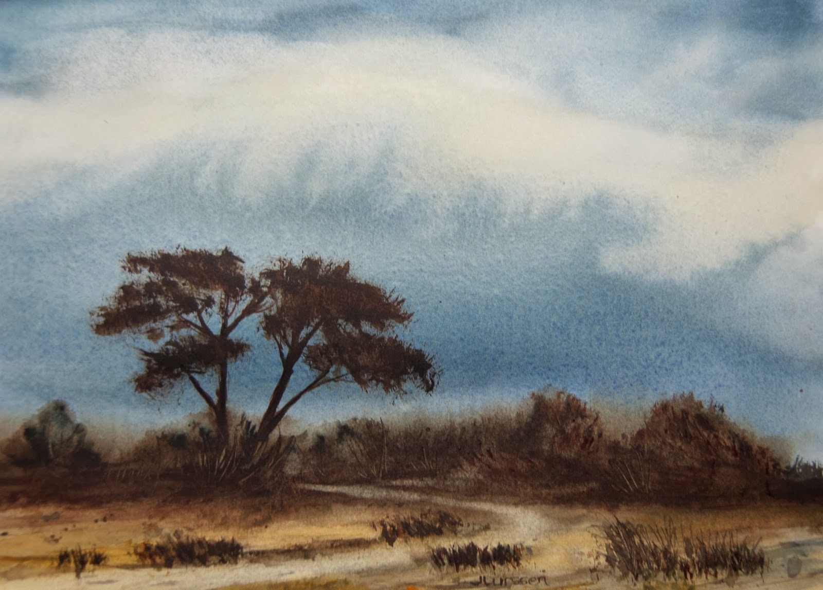
I always start off painting my skies, trying to make them as moody and atmospheric as possible and then decide from there what I want to add to the watercolor. When I took this to class without a title it was interesting to hear what others saw in the piece. Someone said it looked like an approaching storm, which really surprised me since I had painted mostly blue sky. I thought it was not atmospheric enough for my liking. Our instructor thought it looked a little like the Australian outback. Hmmm. It reminds me a little of the dry summers here in norther California, so for now I'm going to call it California Summer but may change it if I come up with something better.