3.23.2014
Horizontal versus Vertical
3.18.2014
Poppy Field
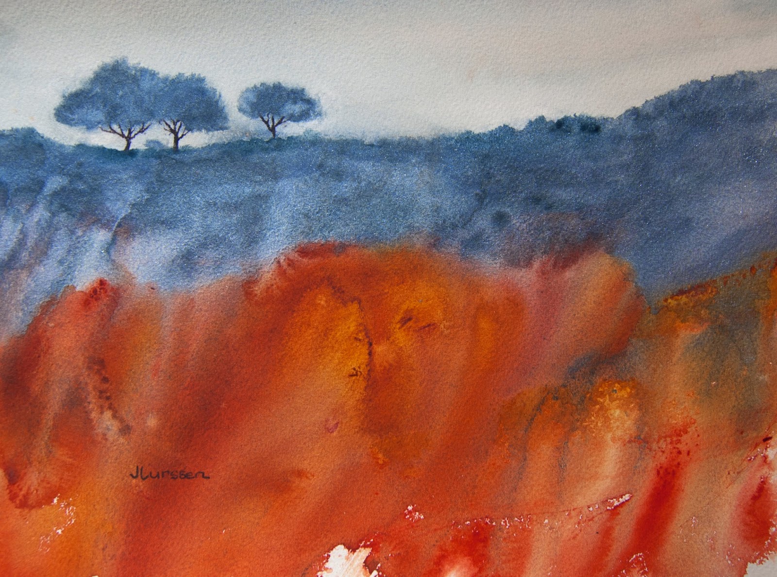
I wanted to paint a watercolor in a more abstract way than painting the detail of the buttercups - or what we call here in America the California poppy. I prefer a more abstract approach to this type of painting. I used Indian Yellow, Quinacridone gold, Aureolin and a little transparent pyrrol orange for the fields, and my new Daniel Smith kyanite genuine for the foreground rocks and Blue apatite genuine for the distant mountains. Size is 11" x 14".
3.14.2014
Experiments in Watercolor
3.06.2014
Mt Tam Mist
1.16.2014
Winter Glow
More experimenting with acrylic inks. I feel I need a lot of improvement still and need to branch out a bit. I do like the colors in this experiment though. For any of you who have never seen Ann Blockley's acrylic ink paintings, they are definitely worth a visit, as is all of her work. Click on her name to go to her blog post. There is a lovely acrylic ink painting just below the post for her latest book - which I will definitely order. She is a great inspiration for the kind of watercolors I like painting.
1.09.2014
Mystic Glade
I was lucky enough to get two nice gift certificates for Christmas to my favorite local art store. It is fun to browse around and buy materials for experimenting without having to be conscious of the cost. In 2013 I started to experiment with acrylic inks and had some successes which I have posted previously on my blog. I bought a few more colors this year and was excited to do more experimenting. The first two attempts were not that successful, but I was pleased with this third try. I found that it worked better if I applied a layer of gesso to the watercolor paper and let it dry before applying the inks. Playing around like this really helps one loosen up.
12.05.2013
Morning Glow
Trying different color combinations with glazing. The sky is a mixture of indigo and Indian yellow. I was pleased with the effect of the glow in the lower sky that one can sometimes see when the sun rises in the morning. The hills and trees are mixtures of burnt sienna and ultramarine and some acrylic sepia ink and some dribbling of granulation medium.
11.21.2013
Tangled Undergrowth II
10.12.2013
Nightfall
It was very difficult getting the colors right for this posting. The watercolor is actually a little darker than it appears here, especially in the foreground. I wanted to paint an atmospheric night scene using a
range of blues. It took about ten coats of glazing to get to this stage.
I almost abandoned it halfway through because it looked uninteresting.
For the last stage I decided to take a rough painters brush and using
Daniel Smith's indanthrone blue mixed with neutral tint I swept the
brush back and forth and left it to dry. I think it really made the sky
come to life. I then had to come up with something interesting to paint
in the bottom third of the painting. It had to be something simple that
did not detract from the sky, which I wanted to be the focus of the
watercolor. I was pleased with the end result of this piece. Size is 14"
x 10". I used indigo, French ultramarine, indanthrone blue and neutral
tint for the sky, and burnt sienna with French ultramarine, raw sienna
and a little sepia ink for the land area.
10.01.2013
Autumn Symphony
It's that time of year again. One of the things I miss most since moving from the east to the west coast is how the leaves change color in the fall. What I don't miss is having to rake them up - but it is a beautiful sight while it lasts.The photos of the different stages accidentally got deleted so I will describe them for you.
Stage 2: I proceeded to splash more Indian yellow, transparent yellow and a mixture of Quinacridone burnt orange and aureolin onto the sheet. I spritzed this lightly with a spray bottle which changes the round dots to random shapes that more resemble leaves. I let this dry completely.
Stage 3: For the next to final stage I crumpled up some saran wrap into a ball and dipped it into all of the same colors - plus some Daniel Smith olive green to add some darks - and dabbed this all over the piece. When this was dry I brushed off the masking fluid and painted the tree trunks and branches with a mixture of quinacridone burnt orange mixed with French ultramarine which makes a very nice grey. I added a few more dabs of paint to make the colors a little richer. The final step was making a darker mixture to paint the markings on the bark.
Subscribe to:
Posts (Atom)


